Project information
CLIENT
Korosu
CATEGORY
Graphic Design
SUBJECT
game interface
 final design
 concept
CLIENT - ASSIGNMENT - GOAL
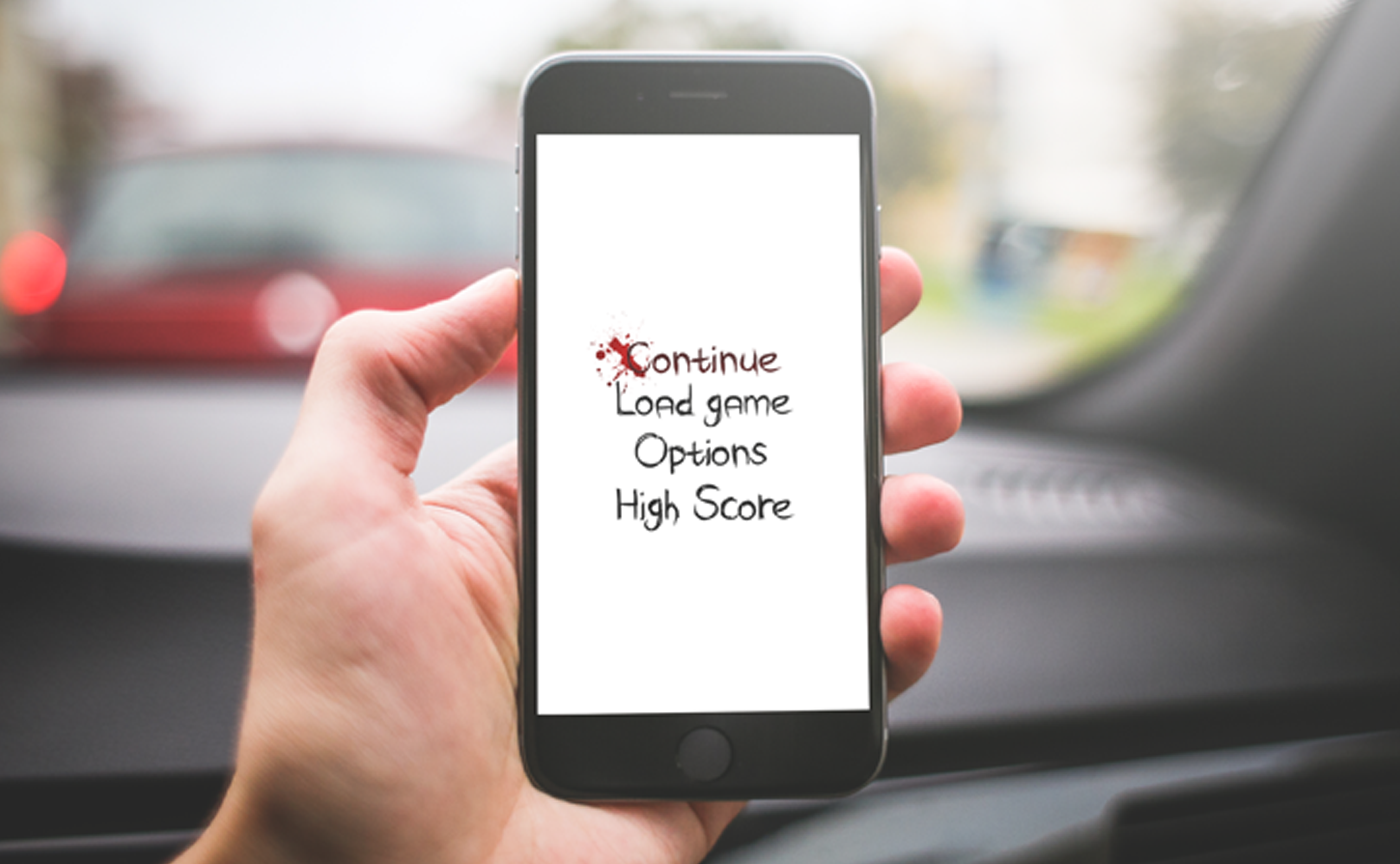
Korosu is a mobile horror game developed by an independent indie game developer. The game is set in a dark, Japanese inspired universe and combines psychological suspense with visual storytelling. To launch the game professionally, I was asked to design a matching custom typeface for the logo and create the visual interface design, including the start menu, settings menu, and pause screen.
The visual style needed to enhance the game's tension and mystique without distracting from the gameplay. The goal of the project was to create a strong visual identity that would immediately immerse players in the game’s atmosphere from the very first screen, while also establishing a distinctive and consistent user experience.
A key requirement was that the logo and interface needed to perform well on small mobile screens without compromising mood or legibility.
CHALLENGES - MY ROLE - PROCESS
A major challenge was finding the right balance between looks and usability. The style needed to be eerie, suspenseful, and unique, while remaining fully legible on small mobile displays. The custom typeface had to feel authentic without resorting to clichés and needed to be technically suitable for in-game implementation. Since this was a solo development project with limited resources, careful prioritization was essential.
My role was that of graphic designer. I worked independently on this project, in direct collaboration with the developer. We started with a research phase in which I explored the visual language of Japanese horror, traditional calligraphy, and existing horror game interfaces. Based on this research, I created moodboards and typographic sketches, which I discussed with the client to define the visual direction.
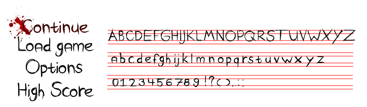
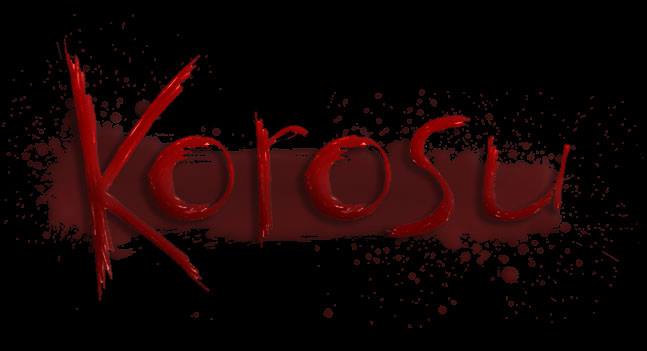
Once we agreed on a direction, I developed a custom typeface specifically for the logo, inspired by rough brushstrokes and subtle imperfections. I then designed the UI elements for the main menu, settings, and navigation buttons. All designs were presented in context through mockups and animation proposals, allowing the client to clearly evaluate the overall experience.
RESULTS - IMPACT - REFLECTION
The final result was a unique, handcrafted font that perfectly captured the tone of the game: mysterious, ominous, and full of character. The logo resembles a dark symbol from an unknown world and immediately draws the viewer’s attention. The interface complements it visually with a minimal yet atmospheric style, clear hierarchy, and subtle animations that enhance the tension without becoming overwhelming.
The client was extremely pleased and described the design as "essential to the game's immersive experience." During early testing, users described the UI as "intuitive yet atmospheric" and praised the typeface for enhancing the game's credibility. Since the soft launch, the game has received positive feedback from niche horror gaming communities, with the design frequently highlighted as a standout element.
What I learned from this project is how powerful typography can be as a voice for a brand or experience, especially in gaming, where style and immersion are deeply intertwined. I was also reminded of the importance of testing design decisions in realistic contexts. In future projects, I would invest even more in animation iteration to make interactions feel even more dynamic and engaging.