Dashboard design
Arval
CLIENT - ASSIGNMENT - GOAL
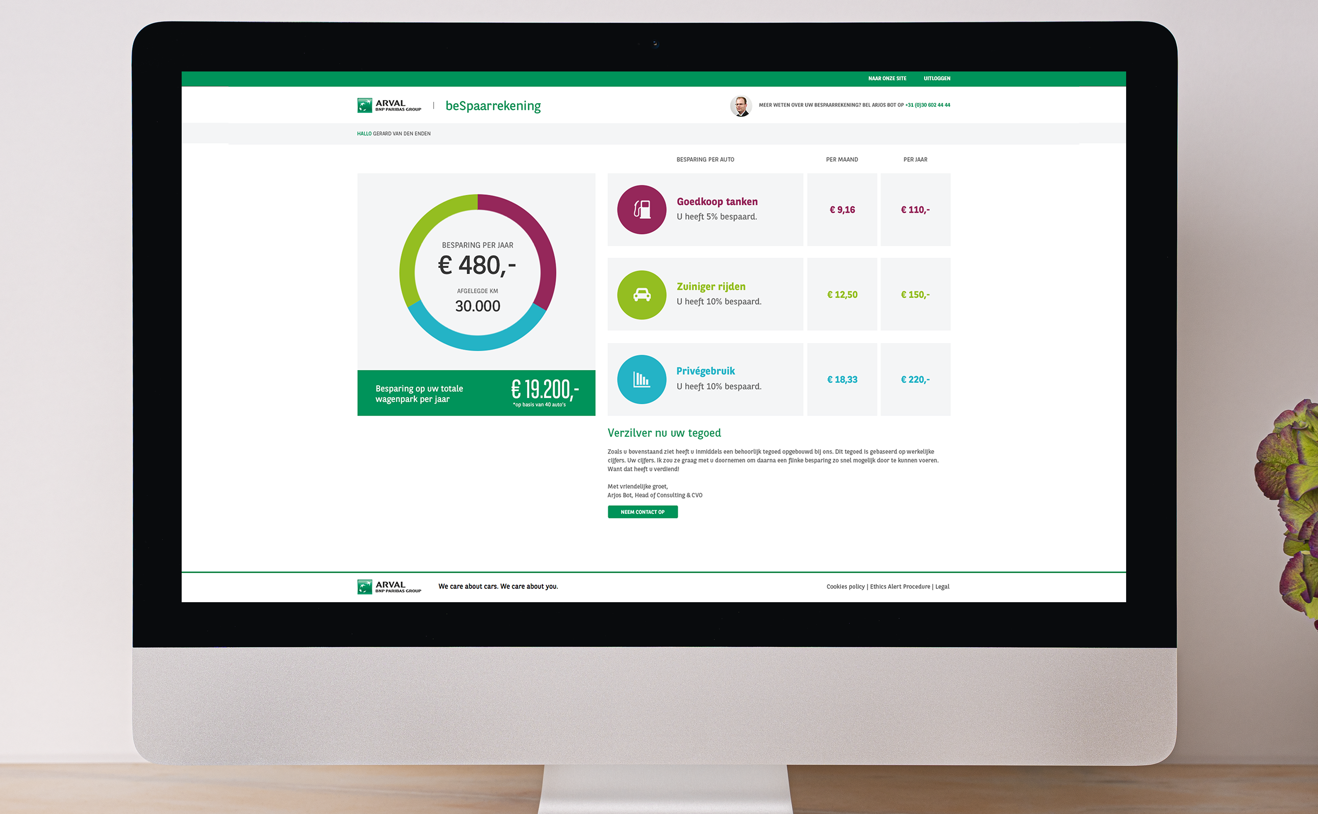
For this case, I worked on a project for Arval, an internationally well-known company specializing in vehicle leasing and innovative mobility solutions. Arval’s clients range from large international corporations to small businesses and independent retailers. The assignment was to design a one-pager for their Mobility Link: a personal dashboard that provides users with insights into their completed journeys.
The one-pager would become part of a broader digital solution that Arval offers to its clients. The dashboard needed to be not only functional but also visually aligned with the brand identity and user-friendly for a diverse target audience.
The objective was to design a clear, accessible, and visually appealing interface that would allow clients to quickly and intuitively gain insights into their mobility data, while maintaining Arval’s professional and trustworthy image.
CHALLENGES - MY ROLE - PROCESS
A key challenge in this project was combining a large amount of functional information within a limited space, without making the overall layout feel cluttered or overwhelming. In addition, the design had to be intuitive for various types of users, ranging from experienced business clients to less tech-savvy end users.
In this project, I took on the role of web designer. I worked from wireframes developed by my colleague and translated them into a visual design that fully aligned with Arval’s brand guidelines. In doing so, I carefully considered color usage, typography, and the overall brand identity.
I ensured a clear hierarchy of information, visual clarity, and consistent styling to present the content in the best possible way. Throughout the process, I regularly coordinated with my colleague and stakeholders to make sure all elements aligned well with the project’s expectations and objectives.
RESULTS - IMPACT - REFLECTION
The result was a clean and well-structured one-pager that presents mobility information in a visually appealing way. The client responded enthusiastically to the design and indicated that the dashboard was a valuable addition to their customer portal.
The clear layout and consistent design contributed to a pleasant user experience, and the one-pager was integrated into the platform with minimal adjustments.
What I learned from this project is how important it is to visually simplify complex information without compromising functionality. I also rediscovered the value of collaborating within a multidisciplinary team, where wireframes and visual design align seamlessly.