Flyer design
Lindenhaeghe
CLIENT - ASSIGNMENT - GOAL
Lindenhaeghe is a renowned training and examination institute within the Dutch financial sector. The organization focuses on educating, training, and certifying professionals in the financial services industry. With a broad range of courses and learning formats, Lindenhaeghe responds to the diverse learning needs of both individuals and organizations.
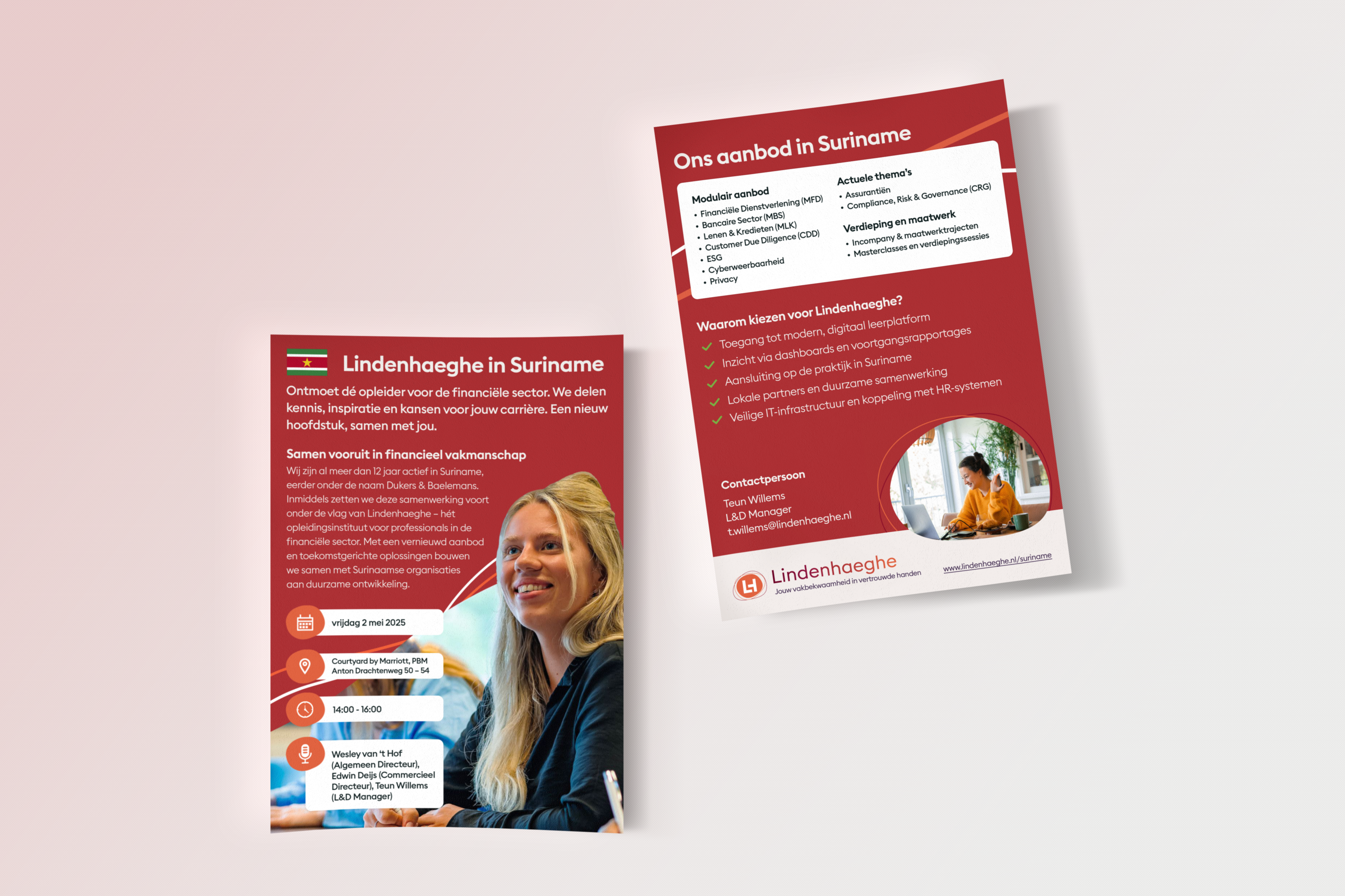
For the introduction of the brand to the Surinamese market, an event campaign was developed, including a flyer among other promotional materials. The assignment focused on visually supporting this launch moment and strengthening the brand identity within a new context. Central to this process was adapting the existing corporate identity to a new target audience.
The goal of the assignment was to create a professional, accessible, and trustworthy first impression. The materials needed to draw attention to the event while simultaneously communicating the added value of the educational offerings. In addition, the focus was on building trust within a new market.
CHALLENGES - MY ROLE - PROCESS
The main challenge was translating an existing corporate identity to a new market without losing recognizability and consistency. At the same time, the design needed to align with a different cultural and business context. This required a careful balance between innovation and brand consistency.
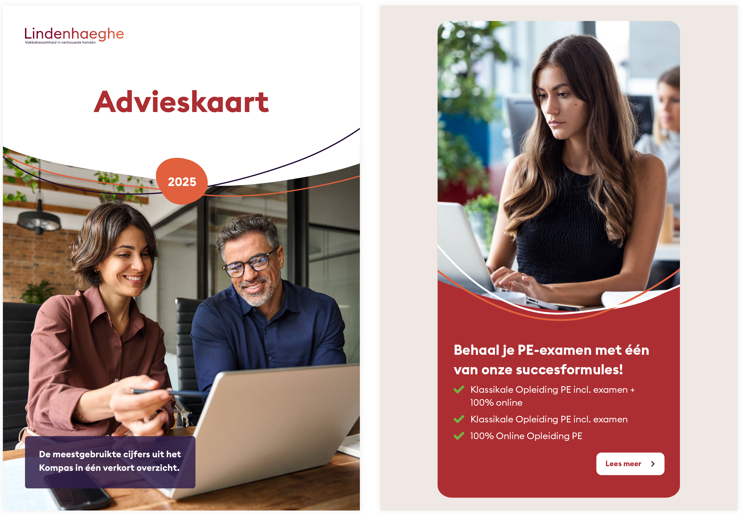
Within this assignment, my role focused on designing the flyer. I was responsible for the entire visual concept, the composition, and translating the brand identity into two different communication materials. Both designs needed to align visually and reinforce one another.
The process began with analyzing existing communication materials from Lindenhaeghe and researching the brand’s visual direction. Next, various concepts were developed and tested through different compositions. These iterations were refined into one consistent visual identity in which typography, color, and hierarchy work together cohesively.
RESULTS - IMPACT - REFLECTION
The final result consisted of a flyer that formed one consistent campaign. The flyer was designed with a clear information hierarchy, presenting event details in an organized and easily scannable way. The flyer translates the information into a compact and accessible format.
Through the consistent application of the corporate identity, a recognizable and professional appearance was created, contributing to Lindenhaeghe’s positioning within a new market. The campaign strengthened both the visibility of the event and the introduction of the brand in Suriname. As a result, the communication became not only informative, but also convincing and trustworthy.
This assignment further strengthened my understanding of working within existing brand identities. In particular, translating one concept into multiple communication materials proved highly valuable in practice. In addition, I learned how important it is to carefully balance information, readability, and visual impact.